Plot
The Plot command has several options and can be confusing.
The help text for the “Type” property of the Plot command is:
One of {Circuit | Monitor | Daisy | Zones | AutoAdd | General (bus data) | Loadshape | Tshape | Priceshape |Profile}
A "Daisy" plot is a special circuit plot that places a marker at each Generator location or at buses in the BusList property, if defined. A Zones plot shows the meter zones (see help on Object). Autoadd shows the autoadded generators. General plot shows quantities associated with buses using gradient colors between C1 and C2. Values are read from a file (see Object). Loadshape plots the specified loadshape. Examples:
Plot type=circuit quantity=power
Plot Circuit Losses 1phlinestyle=3
Plot Circuit quantity=3 object=mybranchdata.csv
Plot daisy power max=5000 dots=N Buslist=[file=MyBusList.txt]
Plot General quantity=1 object=mybusdata.csv
Plot Loadshape object=myloadshape
Plot Tshape object=mytemperatureshape
Plot Priceshape object=mypriceshape
Plot Profile
Plot Profile Phases=Primary
Plot Profile Phases=LL3ph
See the description of the Plot command below in this document or refer to the online information in the Help menu and on the Wiki site. Some tips on creating plots are provided here.
The existing “circuit” plot creates displays on which the thicknesses of LINE elements are varied according to:
- Power
- Current
- Voltage
- Losses
- Capacity (remaining)
Circuit plots are usually unicolor plots (specified by color C1). However, Voltage plots are multicolor depicting 3 levels for voltage. Meter zone plots use a different color for each feeder.
The following example will display the circuit with the line thickness proportional to POWER relative to a max scale of 2000 kW:
plot circuit Power Max=2000 dots=n labels=n subs=n C1=$00FF0000
Colors may be specified by their RGB color number or standard color names. The above example expresses the number in hexadecimal, which is a common form. The last 6 digits of the hexadecimal form give the intensity of the colors in this format: $00BBGGRR. In this way, any color can be produced. The standard color names are:
• Black
• Maroon
• Green
• Olive
• Navy
• Purple
• Teal
• Gray
• Silver
• Red
• Lime
• Yellow
• Blue
• Fuchsia
• Aqua
• LtGray
• DkGray
• White
The “general plot” creates displays on which the color of bus marker dots (see Markercode= option description later in this document) are varied according to an arbitrary quantity entered through a CSV file . The following gives a nice yellow-red heat plot variation of CSV file data field 1 (the bus name is assumed to be in the first column, or field 0, of the csv file; field quantity 1 refers to column 2 of the CSV file) with the min displayed as color C1 ($0080FFFF = yellow) and the max=0.003 being C2 ($000000FF = red). Values in between are various shades of orange.
plot General quantity=1 Max=.003 dots=n labels=n subs=y object=filename.csv
~ C1=$0080FFFF C2=$000000FF
Example results: This plot clearly shows the extent of harmonic resonance involving the residual current (likely, the zero sequence, too) on the circuit.

Figure 10: Color-shaded “heat” plot of harmonic resonance
There is also an option on the plot circuit command that will permit you to draw the circuit with LINE object widths proportional to some arbitrary quantity imported from a CSV file. The first column in the file should be the LINE name specified either by complete specification “LINE.MyLineName” or simply “MyLineName”. If the command can find a line by that name in the present circuit, it will plot it.
The usual thing you would do is to export a file that is keyed on branch name, such as
Export currents, or
Export seqcurrents
Then you would issue the plot command, for example, to plot the first quantity after the Line object name:
Plot circuit quantity=1 Max=.001 dots=n labels=n Object=feeder_exp_currents.CSV
The OpenDSS differentiates this from the standard circuit plot by:
1. A numeric value for “quantity” (representing the field number) instead of “Power”, etc
2. A non-null specification for “Object” (the specified file must exist for the command to proceed).
In the standalone EXE version of the program, the Plot > Circuit Plots > General Line Data menu will guide you through the creation of this command with menus and list prompts (Hint: turn the “VCR button” recorder on). The first (header) row in the CSV file is assumed to contain the field names, which is common for CSV files.
For example, the same plot as above with line thicknesses instead of colored dots.
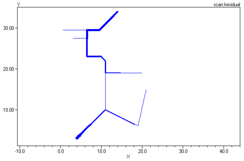
Figure 11: Thickness-weighted plot of harmonic resonance
Much more information is available on the Wiki site.
Voltage profile plots are quite useful. Figure 12 shows a profile plot from the unbalanced IEEE 8500-Node Test Feeder case. This was generated by issuing the following command after the solution:
Plot Profile Phases=ALL
The options for the Phases property for Line-Neutral voltages are:
Plot profile ! default – 3-phase portion of the circuit
Plot profile phases=all
Plot profile phases=primary
Options for Line-Line voltages are:
Plot profile phases=LL3ph
Plot profile phases=LLall
Plot profile phases=LLprimary
Prerequisites for this command are to have an Energymeter at the head of the feeder and have the voltage bases defined. The program plots the per unit voltage magnitude at each node for each Line object in the Energymeter’s zone. LV (secondary) Line objects are plotted as a dotted line. This puts the “beard” on the plot.
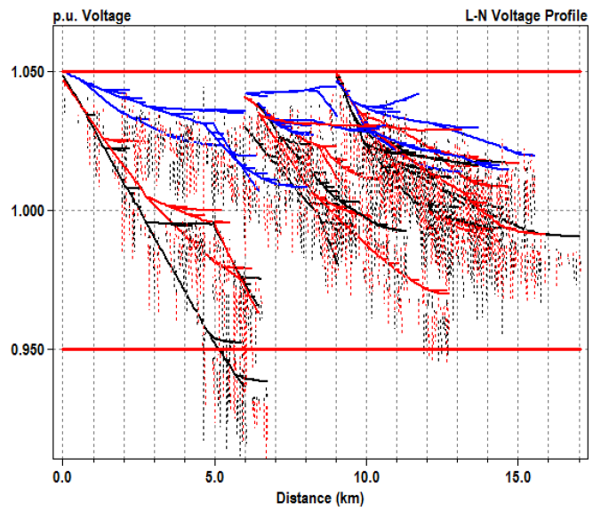
Figure 12. Voltage Profile Plot from IEEE 8500-Node Test Feeder
Lines that drop toward zero in the profile plot are for nodes that likely do not have a connection to the main power source (i.e., are floating). These may have no impact on the solution, but should be investigated and corrected if necessary.
To get the best profile plot, each LINE object should have the Length and Units properties specified. If the Units property is omitted and the Length property is 1.0, it will be assumed that this is a 1 km line, which usually is not correct. A distorted profile will result.
The horizontal lines on the plot coincide with the settings for the normvminpu and normvmaxpu options for the active circuit. These default to 0.95 and 1.05, respectively. To change them, execute a script like this:
Set normvminpu=0.90
Set normvmaxpu=1.10
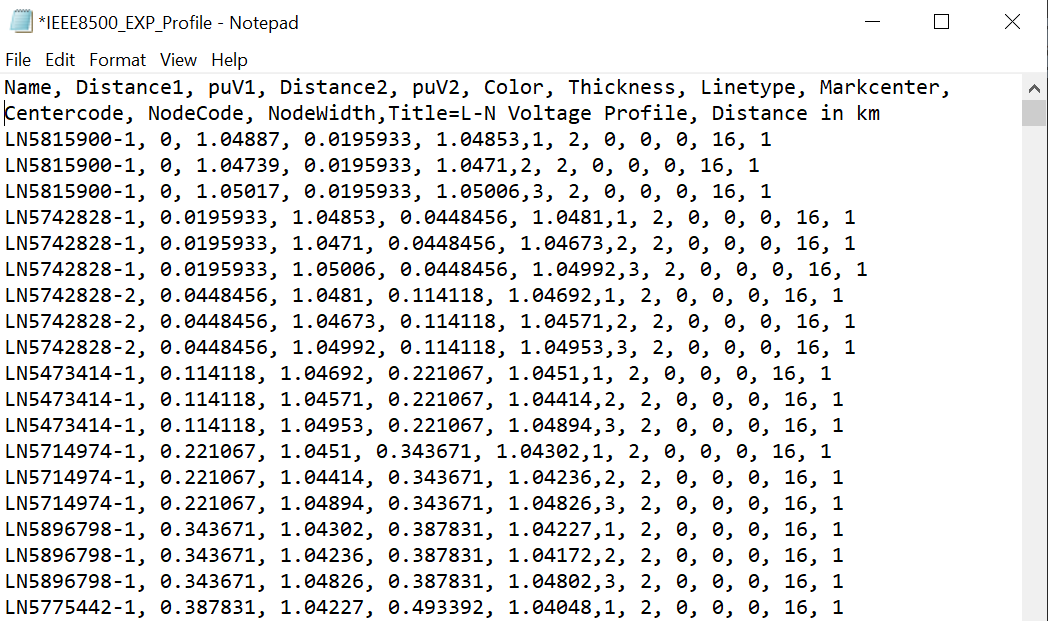
Note: You may also export the data for this plot using the Export Profile command. The resulting CSV file gives you coordinates you may use in other graphics tools. The format is similar to the Plot command:
Export Profile Phases=option [optional file name]
The Phases property has the same options as the Plot command. A snippet of the CSV file exported for the command Export Profile Phases=All for the same case as above is shown here (the header row is wrapped):