TechNote Using the General Plot
The General Plot Command
One of the types of plots you can get out of the OpenDSS plotting function is the General plot. This useful and informative plot is designed to display somewhat arbitrary data related to bus quantities using a color gradient.
The General plot type can be used to plot any quantity from a CSV file whose first column is the bus name. The CSV file may be multicolumn. The column that is plotted is specified by the Quantity property of the Plot command. The first line in the file is expected to be a header line.
Typically the values would come from an Export command that exports a bus quantity such as voltage. Currents and powers would be branch quantities and would be plotted using the Type=Circuit option. Of course, the CSV file can be written by an external program for some derived quantity. We often do this using the MS Excel program.
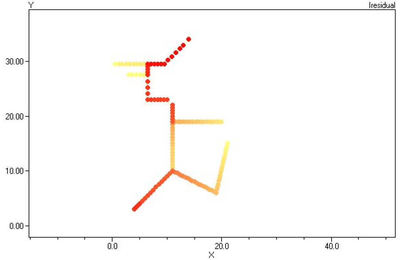
Here is an example from the User Manual:
plot type=General quantity=1 Max=.003 dots=y labels=n subs=y object=MyFile.csv C1=$0080FFFF C2=$000000FF
This command was used to generate the following chart of harmonic current distortion magnitudes:
Key Properties
•Type: Must be "General" for this type of plot
•Quantity: The number of the column, or channel, of the CSV file that is to be plotted.
•Max: If specified, defines the value associated with color C2. If not specified, the program will determine maximum values for the data to be plotted and automatically scale the dot colors between min and max. Use the Max property to highlight buses with values above the values specified for Max. All values greater than or equal to Max will be displayed in C2.
•Min: If specified, defines the value associated with color C1. If not specified, the program will determine minimum values for the data to be plotted and automatically scale the dot colors between min and max. Values less than Min will be displayed in color C1.
•Dots: Flag that indicates whether the "dots" placed on the bus locations should be displayed. Is always Yes for General plot because the dots are used to convey the key information from the plot.
•Object: The name of the file containing the CSV data. The first column is expected to be the name of a bus in the circuit. (It is OK if the bus is not found; it is simply ignored.) The first row is expected to be a commaseparated header for the file. This is the standard for files written by the Export command. To see an example, simply execute an Export command after a solution.
•C1: RGB color code for color corresponding to the minimum value.
•C2: RGB color code for color corresponding to the maximum value.
This command sets the color for each dot based on the results by proportionally scaling the R, G, and B values ofthe color code between C1 and C2. The above example scales the colors between Yellow and pure Red where red represents the max values. Thus, the plot will fade from red through various shades of orange down to yellow.
You can obtain the RGB color codes from the Plot Options menu. You may also use the Plot | Circuit Plots | General Bus Data menu to build the General Plot command. If you turn on the Record Commands button, the program will automatically place the generated command at the end of your active script window.
Hint: After issuing an Export command that exports a bus quantity, you can obtain the exported file name from the Result window so you can copy-and-paste into the plot command script. Sometimes, the exported file will have buses not shown on the circuit plot (i.e., there are no coordinates for them), but have values that skew the coloring on the plot. You may have to edit the file to delete unwanted records if that is the case.
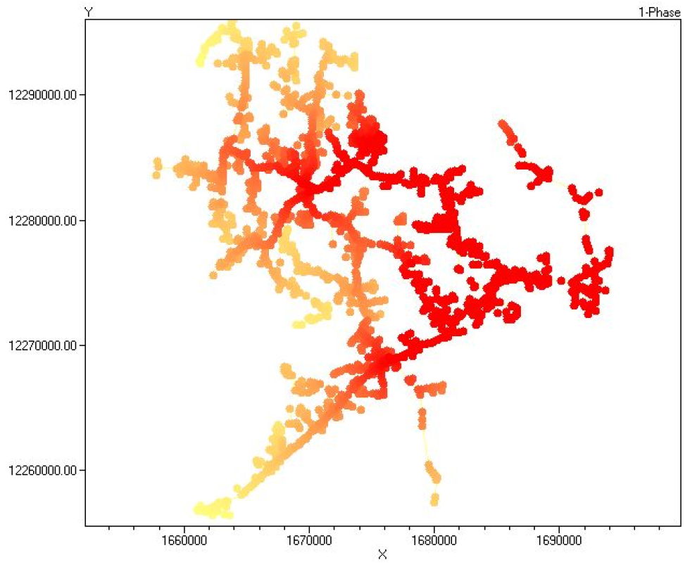
IEEE 8500 Node Test Feeder Example
This example is a General bus data plot of the 1phase fault currents for the IEEE 8500 Node Test Feeder (available here (http://electricdss.svn.sourceforge.net/viewvc/electricdss/IEEETestCases/8500Node/) on the OpenDSS SourceForge site as well as in the download and other places on the Internet).
// Make a fault current plot
solve mode=f
export fault
Set MARKERCODE =24
Set NODEWIDTH=2
plot general quantity=2 Object=(C:\DSSdata\IEEETest\8500Node\IEEE8500_EXP_FAULTS.CSV) c2=$000000FF fileedit C:\DSSdata\IEEETest\8500Node\IEEE8500_EXP_FAULTS.CSV
The exported CSV file looks like this:
Bus, 3Phase, 1Phase, LL
_hvmv_sub_lsb, 7116, 7544, 6134
hvmv_sub_48332, 7116, 7544, 6134
m1009763 , 858, 603, 706
l2673322 , 583, 583, 0
m1069148 , 747, 747, 0
l2673309 , 732, 732, 0
m1069588 , 939, 939, 0
The first column is the bus name, followed by the 3phase fault (actually all-phase fault) values, the single-phase fault values, and the Line-line fault values. Since all buses have at least one phase, we chose to plot column 2, the 1phase fault value. Otherwise, there might be several zeroes in the plot data.
Interesting Items in this Example
We decided to change the default bus marker symbol to symbol 24, which is a solid circle. This often gives a better plot. Otherwise, it is symbol 16, a smaller circle with no fill. The available symbols are:

•Max was not specified so the program automatically scaled the plot.
•The node marker width was increased from 1 to 2. Overlapping dots often make for a better-looking plot
This produces the plot shown below.

Fault Current Magnitudes for 8500Node Test Feeder: Default Scaling
Note that the deep red dots are concentrated near the substation. This is expected because the fault current falls off fairly rapidly as we leave the substation. This type of plot is useful primarily for identifying high fault current regions. But let's say that we want to identify all areas where the SLG fault current is at least 2000 A. We can achieve this by specifying the Max property in the Plot command as follows:
plot general quantity=2 max=2000 Object=(C:\DSSdata\IEEETest\8500Node\IEEE8500_EXP_FAULTS.CSV) c2=$
With the same export file, this generates the plot shown below, which might be more informative for some analysis.
Fault Current Magnitudes for 8500Node Test Feeder: Max=2000A